By Tim Oren
Recently our host, Brian Almon, rolled out a new Gem State Chronicle feature Scorecard Explorer, offering Idaho legislator ranking by various organizations. The week before, he had hosted an essay of my own, throwing shade on such one-dimensional scorecards as inferior to statistical mapping of legislative voting coalitions. In a conclusion, I opined: “Once you’ve got the map, you don’t need the scorecards. In fact, scorecards – and even more, endorsements – start to tell you more about the organization making them than about the legislators.” In this follow-up, I will do exactly that with some of the scorecards and organizations from Brian’s collection or referenced in my piece. I’ll start with a few of the scorecards and wrap up with two sets of contrasting endorsements.
Mapping the Scorecards
Here’s a copy of the Idaho 2025 House session from the previous piece, with names included where they will fit.
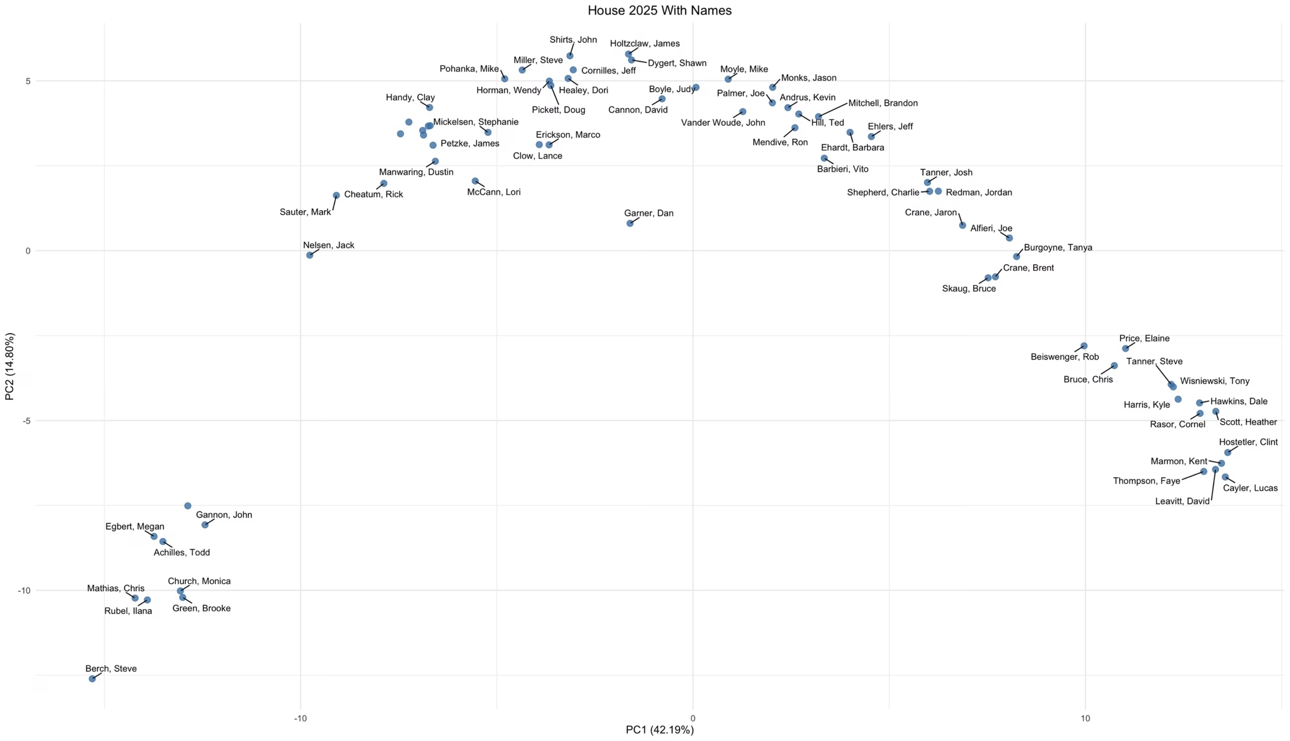
Recall that the X and Y axes here are the two principal factors ‘explaining’ the legislators’ voting alliances on various bills. To place the scorecards on this map, I did simple linear regression of the legislators’ scores on each scorecard, against the two factors. In every case, this results in a highly significant result, with change of randomness (p-value) of less than 10^-15. Which makes sense, as the scorecards are mostly derived from these votes, or similar ones in other sessions. As we’ll see, however, the quality of the fit varies considerably among them.
Having these results, I can add the scorecards to the legislative map. Here’s an example to start:
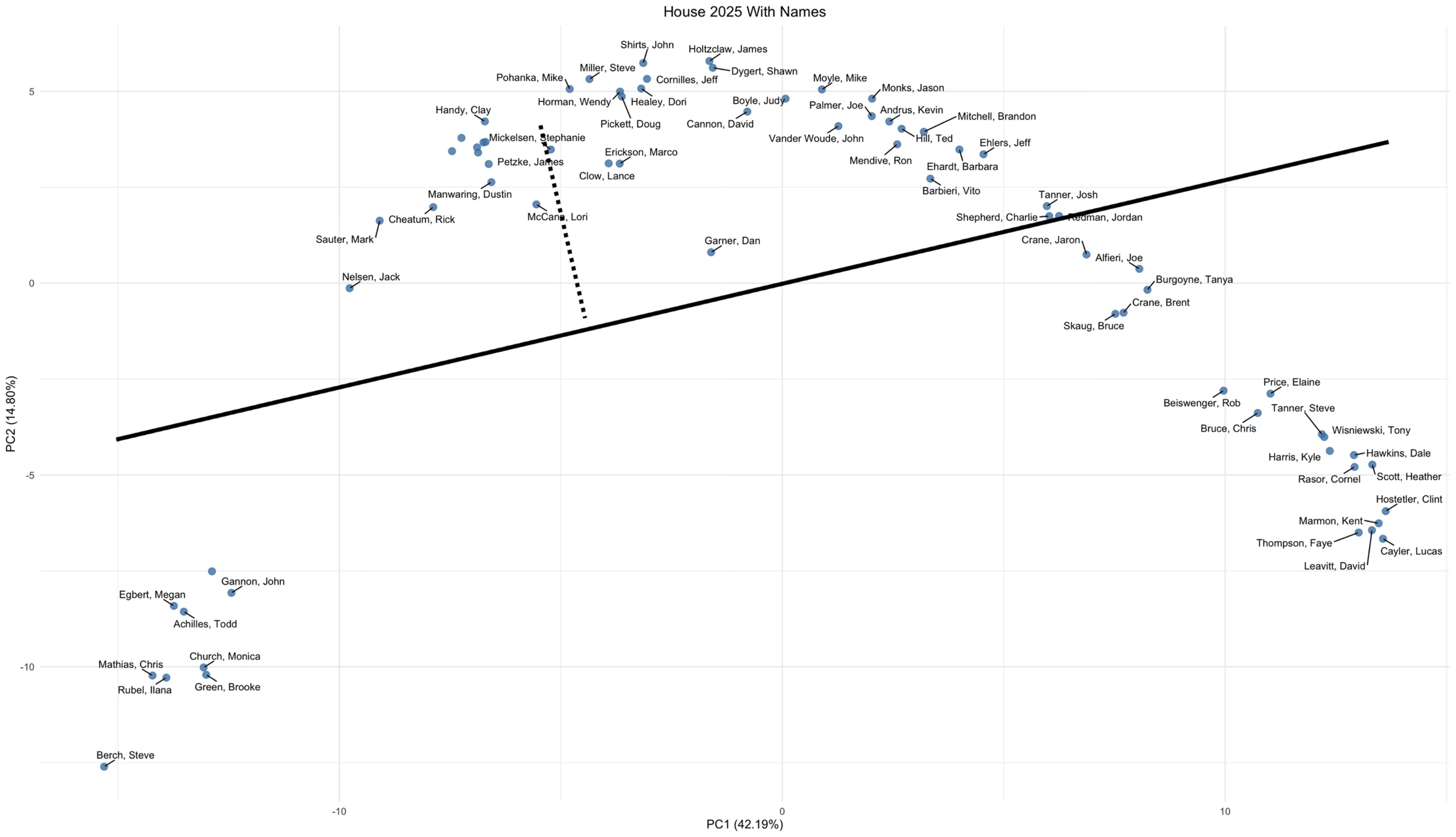
This represents a portion of the IFF Freedom Index. The heavy line is a scale of scores, just like an X or Y axis. Its value increases from left to right in this case. It is used by drawing a line from the legislator of interest to the scale, at a right angle (orthogonally). I’ve done that for Rep. Mickelson as a sample. When I do the algebra, my regression predicts that she will have a Freedom Index score of about 58%. In fact, she received a 56% rating, so that’s a pretty good fit.
The Freedom Index works well with my regression technique: 50% of the predicted scores are within +/- 1.8% and all of them within -7.5% to +5.2% of the actuals. This predictive ability (the smaller span the better) is a useful figure of merit for a scorecard, since it shows whether it’s reflecting how a legislator actually uses their voting power, as opposed to campaign promises and other virtue signaling. In this case, IFF is very transparent about which bills it tracks and how it rates them.
Now I’ll add the other IFF scorecard to the map:
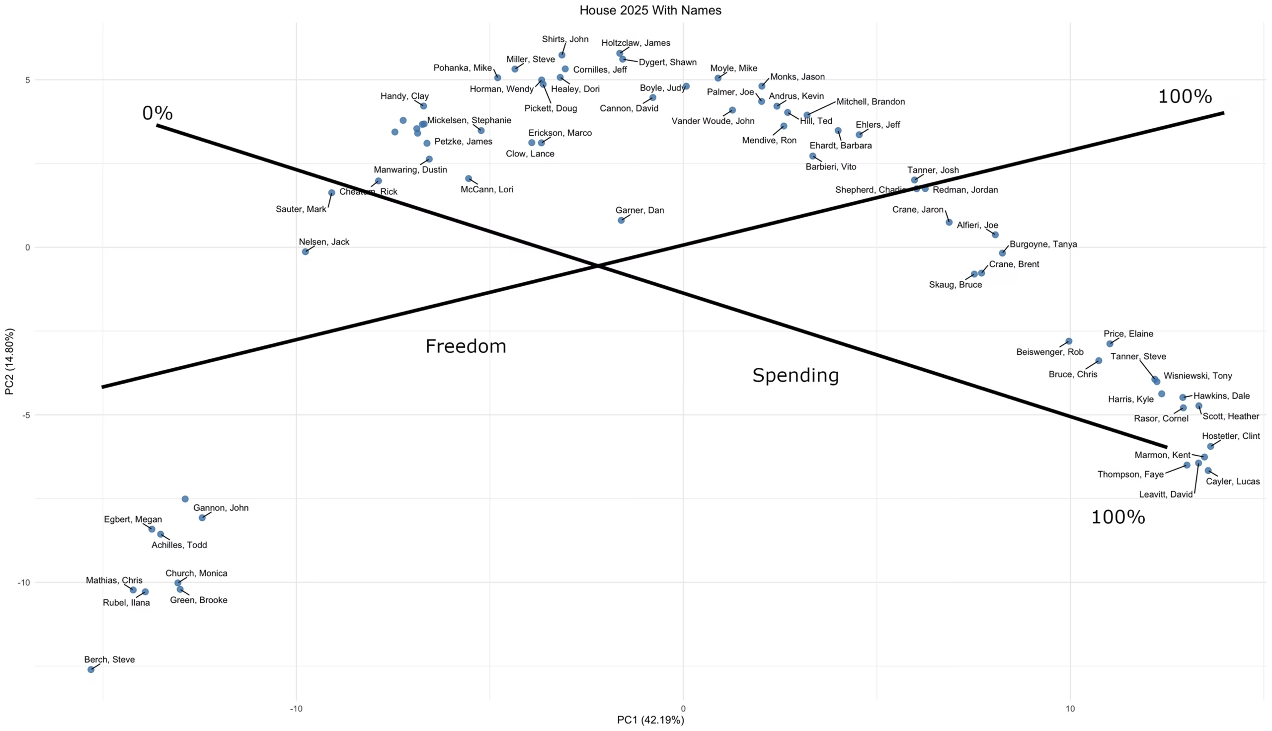
Here I’ve labelled the minimum (0%) and maximum (100%) ends of the scales when they are visible. (0% on the Freedom Index is off chart to the left.) The Spending Index neatly spans the territory from the Gang of 8 at one end, to the D’s and big spending RINOs at the other, with the Swing cluster in the middle. Again, this is a good statistical fit, with 50% of the predictions being +/- 4% of the actual scorecard rating.
Now I’ll look at a couple of conservative aligned scorecards from Brian’s collection. First up is ILA, the Institute for Legislative Analysis, using their scorecard based on the Idaho GOP platform:
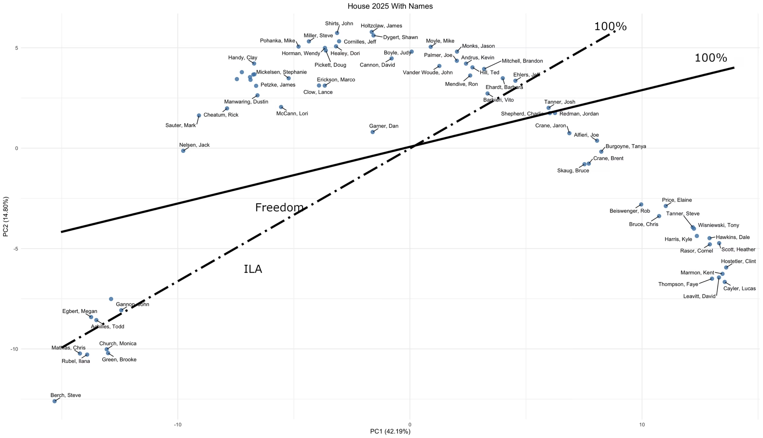
Good is that this is also a transparent model, based on public votes, and the 2-factor regression predicts the scores well, half of them within -2% to +1.5% of the actual score, and all within -7.6% to +9.3%. The ILA scorecard is also highly correlated with the IFF Freedom Index, with an r value of .96.
Bad, however, is that any single number score is going to lose some data. In this case, it’s information about spending related votes. Looking at the ILA scorecard scale, the range of legislators in the Swing cluster is collapsed compared to the IFF Spending index. For instance, one of my own reps, Josh Tanner, gets an 88.1% rating from ILA. In comparison, Tanner’s IFF Freedom rating is 81.6% while his Spending Index score is 54.5%, which provides a lot more information about his actual voting.
Next, we have the arch-conservative John Birch Society (henceforth JBS):
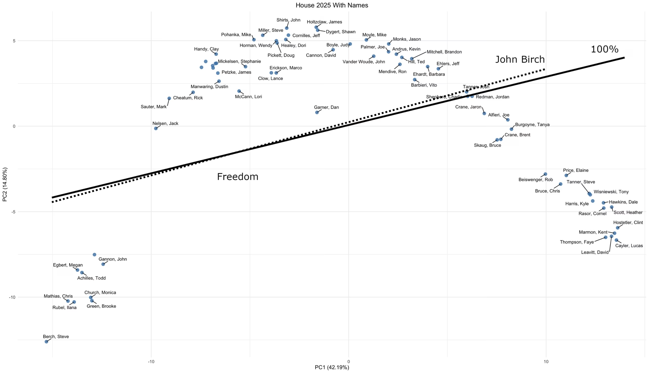
JBS’ scorecard would seem to align perfectly with the IFF Freedom Index, but there’s a catch. The JBS model is opaque – there’s no explanation of its basis, whether votes, public positions, or something else. And while the regression against the map’s two factor is statistically significant, there’s a lot of noise: 50% of the predicted scores lie within -4.7 to +9.2% and there are some serious outliers – the range is -45.6% to +37.2%. I’m sure the JBS scorecard reflects the organization’s ideology, but it does a poor job of representing how particular legislators behave when it comes time to vote.
The Other Team
Here’s the Idaho Association of Commerce and Industry, commonly known as IACI (eye-acky):
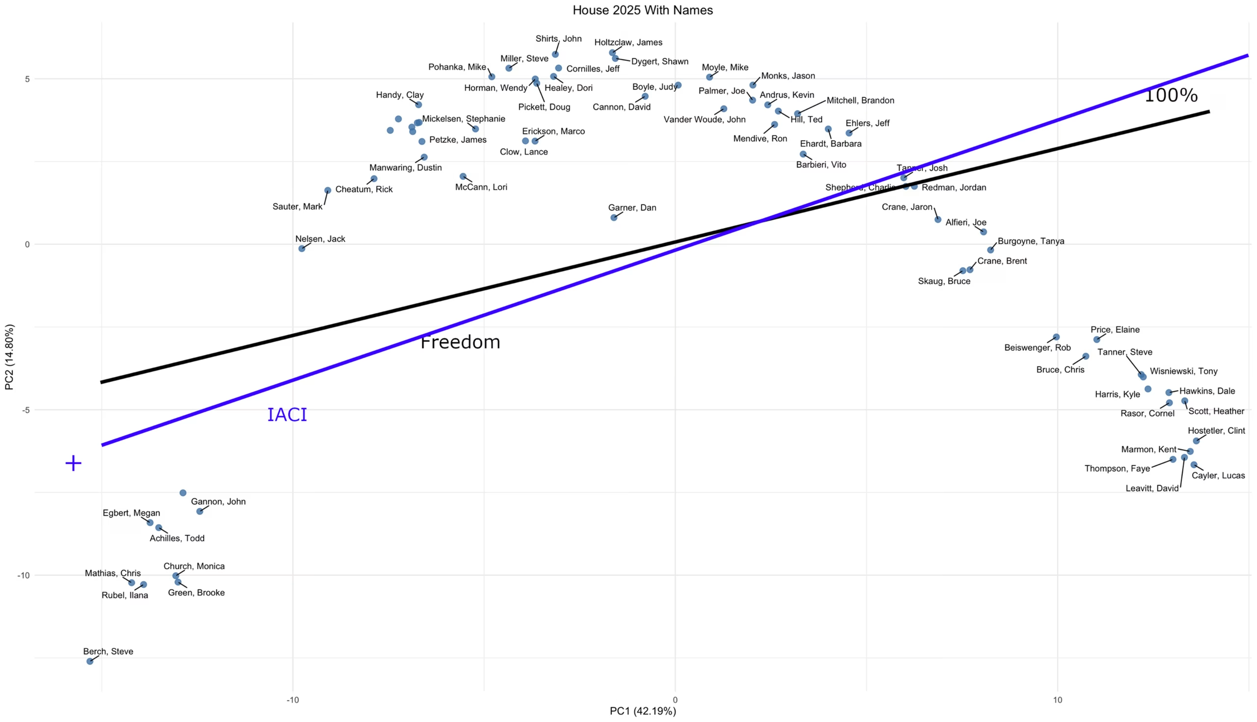
What is IACI? You can read takes from Brian Almon, or Glenneda Zuiderveld. While I’m an advocate of free enterprise — I did a stint in venture capital, after all — I’d have to call IACI a potato-flavored collection of crony capitalists, happy to privatize their profits, while socializing their expenses and negative externalities, whether it’s recruiting and training expenses (LAUNCH), or the social costs of underpaid legal and illegal migrant labor. Thus, it’s no surprise that IACI’s scorecard, while it appears similar to the IFF Freedom Index, actually runs in the opposite direction. The low scores go to legislators who respect Idaho citizens’ pocketbooks and liberties, the high scores to those reps ready to fork over taxpayer money and state authority in return for campaign contributions and other support.
50 percent of the forecast IACI scores lie within -6.4% to +5.2%. There are some notable outliers, with a total span of -28.4% to +28.3%. It is known to be based on floor votes, though a much smaller number than the IFF Indexes.
One more, from a special interest group, Idaho Children are Primary (ICP):
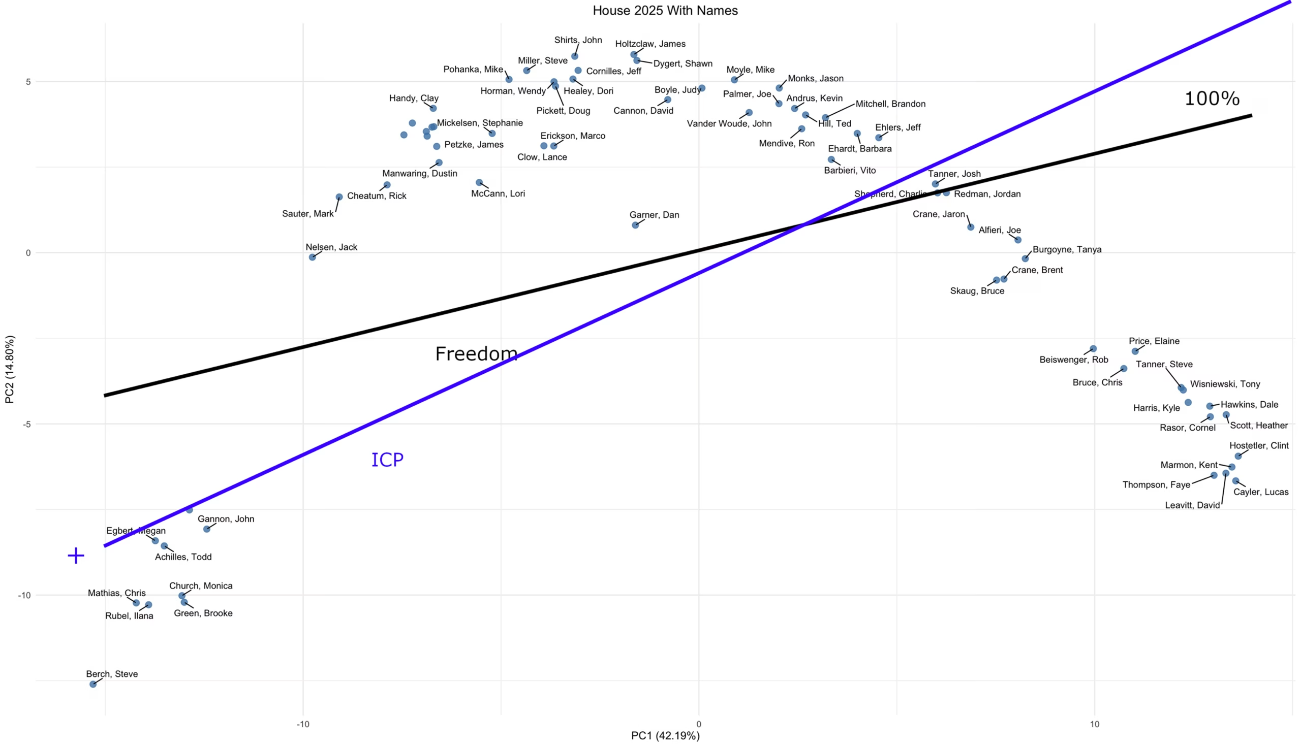
ICP’s ideas of ‘pro-kid’ include opposing school choice and health care autonomy. Strangely enough, the positive side of their scorecard scale points straight at the Democrat cluster on the map. Its correlation with IFF Freedom Index is -.93; you can pretty much predict one from the other, if you reverse the direction.
The ICP scorecard is based on legislative bills, though a rather small number compared to the IFF Indexes. 50% of the forecast ICP scores lie within -7.3% and +8.8%, with extreme outliers at -33.6% and +28%, so one of the poorer scorecards when it comes to fitting the total session map.
And The Oscar Goes To…
IFF wins the scorecards hands down. They are provided during the session, with disclosed bill lists and weights, and correlate very well with the legislative map. Having dual Freedom and Spending Indexes gives nuance on legislators’ positions that one-dimensional scorecards lack (see an afterword). If you’re going to rely on scorecards, it’s the best of Boise. But if libertarian-weighted conservatism isn’t your cup of tea, you can largely predict the other conservative scorecards from IFF’s, or just stand it on its head if you favor IACI.
Mapping Endorsements
With the 2026 primaries looming, we’re going to get a spate of candidate endorsements during or immediately after the legislative session. These give some insight into candidates’ likely alignments, and also into the effective policy of the endorsers. After all, they care about what the map shows – actual voting that favors their interests.
To give some flavor to this, here’s the 2025 House map, with the endorsements of winning 2024 Republican primary candidates by two organizations, IFF and IACI (or rather their aligned PACs – Idaho Prosperity Fund for IACI, and Idaho Freedom PAC for IFF):
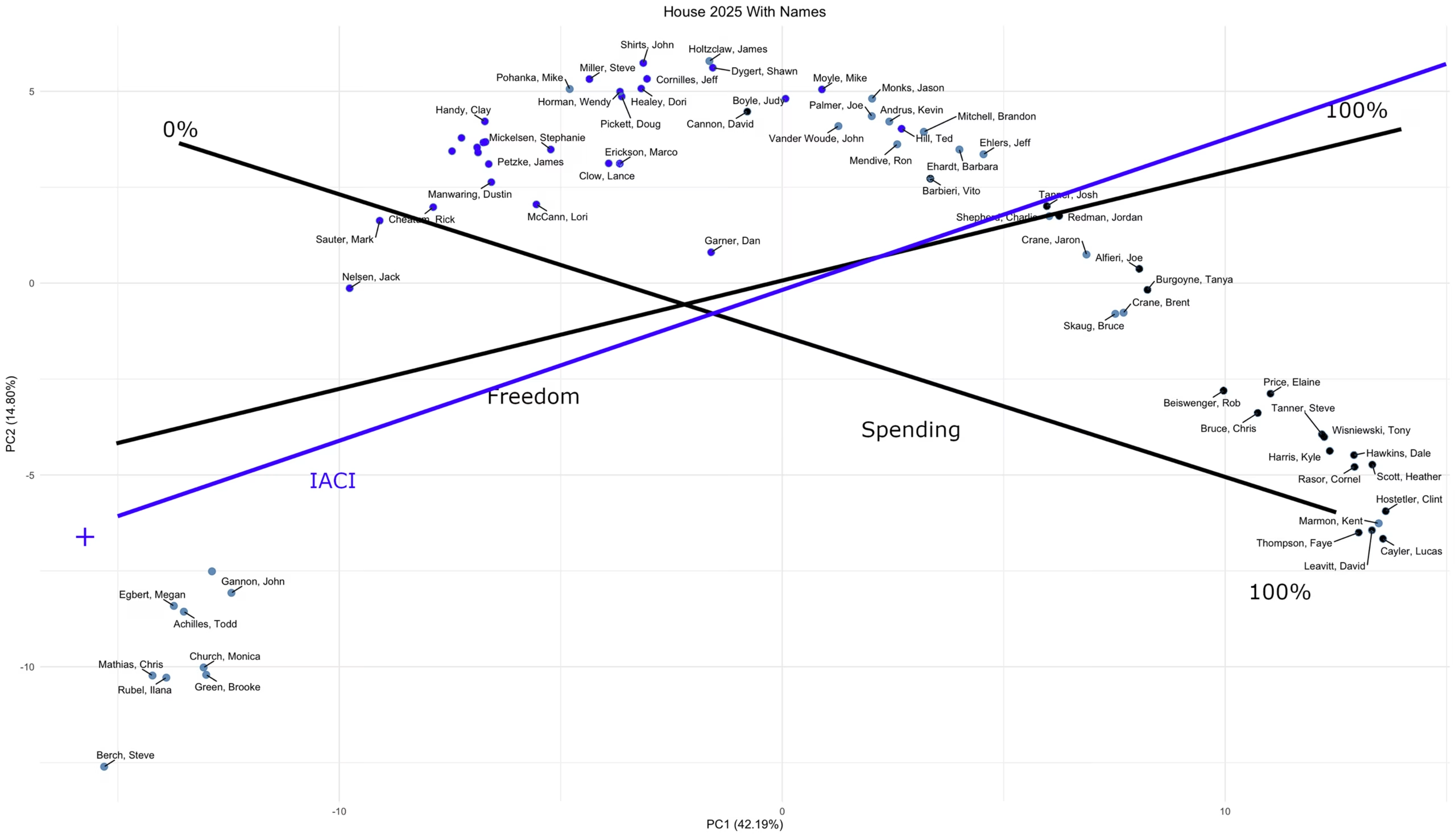
Legislators endorsed by IACI are colored with the bright blue of their scorecard; IFF’s with the black from their two Indexes. It shows most endorsees voting in alignment with their endorsers, with a few outliers each which might be disappointments, deference to powerful positions, or “s/he’s better than the alternative”.
Endorsements (and contributions) are likely to provide as least as much information as any scorecard, as the organizations behind them know what they are attempting to buy/influence. I’m looking forward to repeating this exercise during the 2026 session and primary campaign!
Afterword: Scorecard Correlations
Here’s the complete set of correlations between the scorecards mentioned above, plus the ILA score versus national GOP platform:

Afterword: Scorecards to Map?
Can the Idaho House map be regenerated using only legislators’ scorecard ratings as opposed to votes? Using the above rankings plus a few others, I gave it a try and the answer is just plain NO. Too much information is lost when making one-dimensional rankings, even when they differ. You end up with a single significant factor that is simply partisan alignment. The closest you can get is to use the two IFF Indexes as the axes:
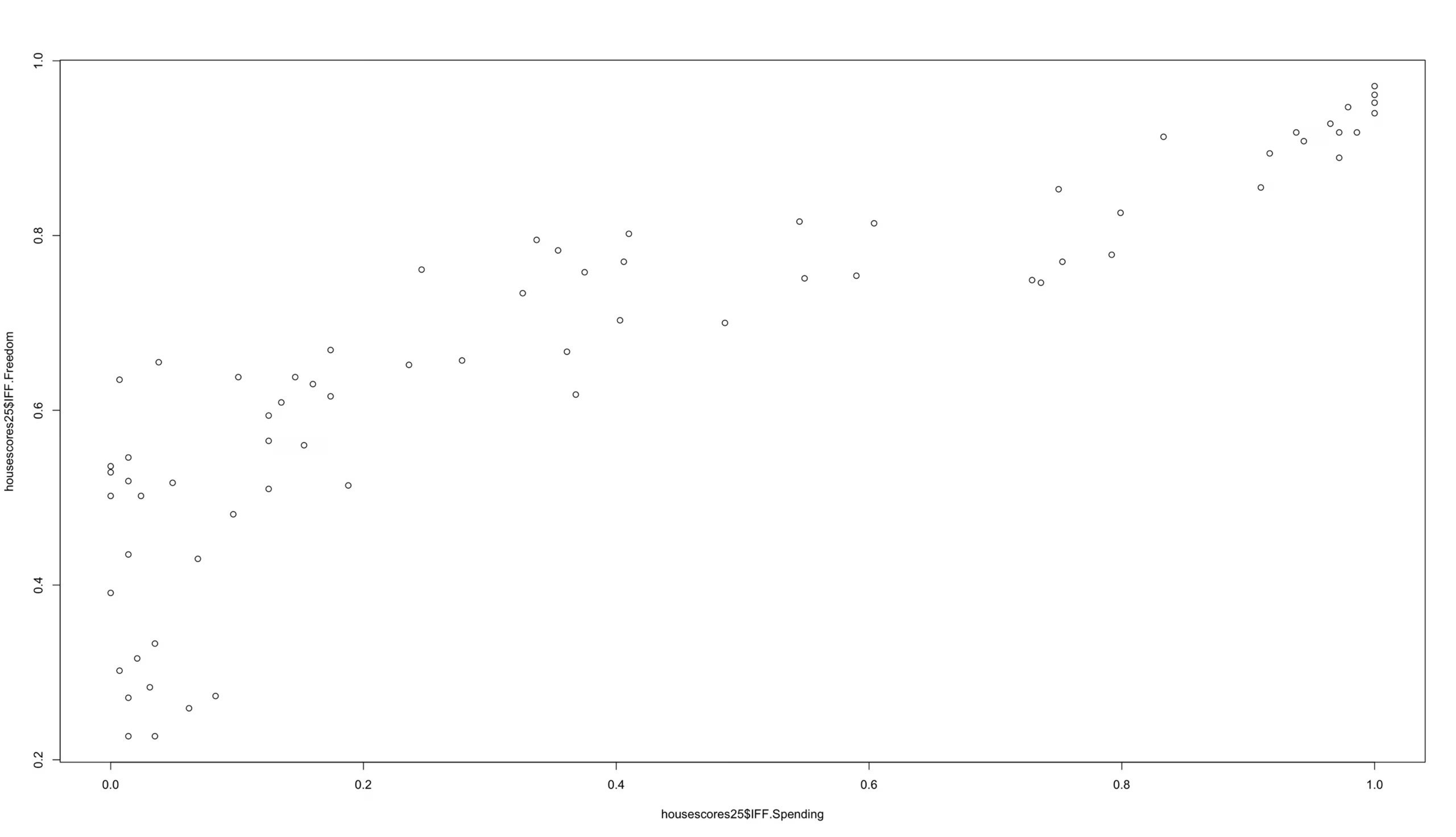
If you squint you can see the Ds in the bottom left, the Gang in the upper right, and the ‘dogleg’ in the middle that reflects the Main Street and Swing clusters of the full map. Another reason to declare IFF the winner of the scorecard contest.
About Tim Oren
Tim Oren retired to Idaho after a 30 year career in Silicon Valley. Here he gardens, home-brews, teaches kids to shoot, and has applied his well-aged statistics degree to subjects such as educational funding and results, Idaho legislative race targeting, and now legislators' voting patterns. He is a contributor to the Idaho Freedom Foundation and a number of Idaho candidates.


