By Tim Oren
Scorecards, scorecards, get yer scorecards. Can’t tell tha playas without a scorecard!
Bygone ballpark chant
Idaho has legislative scorecards. Boy, do we. IFF has one, ILA has one, the state GOP has one, CPAC has one, Club for Growth has one. That’s for just one ‘team’, there’s also IACI, ICP and ACLU and maybe more that Grok and I missed. These provide some measure of accountability to our legislators, but also seem to be an excuse to squabble over individual bill ratings and/or cast aspersions on the rating organizations.
Do we actually need scorecards to hold our legislators accountable? As it turns out, NO, and I’m here to prove it. With nothing but raw vote counts and standard analytic techniques useable on an average laptop, you can get a more informative map of the Idaho legislature and its factions, rather than relying on anyone’s scorecard.
Ways and Means
How does this work? I’ll save the technical details for an afterword. Here’s an attempt at a plain English explanation:
Legislation is a team sport. You can play politics with speeches, ads, or social media virtue signaling, but moving (or stopping) a bill takes a caucus, a squad, a gang (take your pick), usually more than one, who will vote together. A legislator’s effective ideological position is revealed by who they vote alongside repeatedly, more than party labels and outside scorecards.
To show how that works in Idaho, I obtained a record of all the bills and all the votes from the 2025 legislative session. (Thanks to the Idaho Freedom Foundation for letting me play with data they paid to compile.) I threw out all the bills that never came to a full floor vote, and those that were unanimous except for abstains and absences. I did this for the House and Senate separately, since their bill lists are different. I’ll focus on the House in the main discussion, and save the Senate for an afterword.
These were fed to a standard algorithm of a class called ‘unsupervised’. That is, it got no clues other than the vote patterns of how the legislators should be organized. Party identifiers, district numbers and names were omitted as well as bill titles, contents, ratings, and even numbers. The only data visible for each anonymous legislator was their aye/nay/abstain/absent positions, each on the same equally anonymous bills.
The analysis looks for patterns of legislators who are voting together (covariant for those who speak stats), and boils those votes down to a smaller number of factors that ‘explain’ the overall patterns. It turns out to be highly effective in this case, explaining over 55% of the variation seen in 174 votes with only two factors. Here’s what they look like in chart form.
The 2025 Idaho House Playing Field
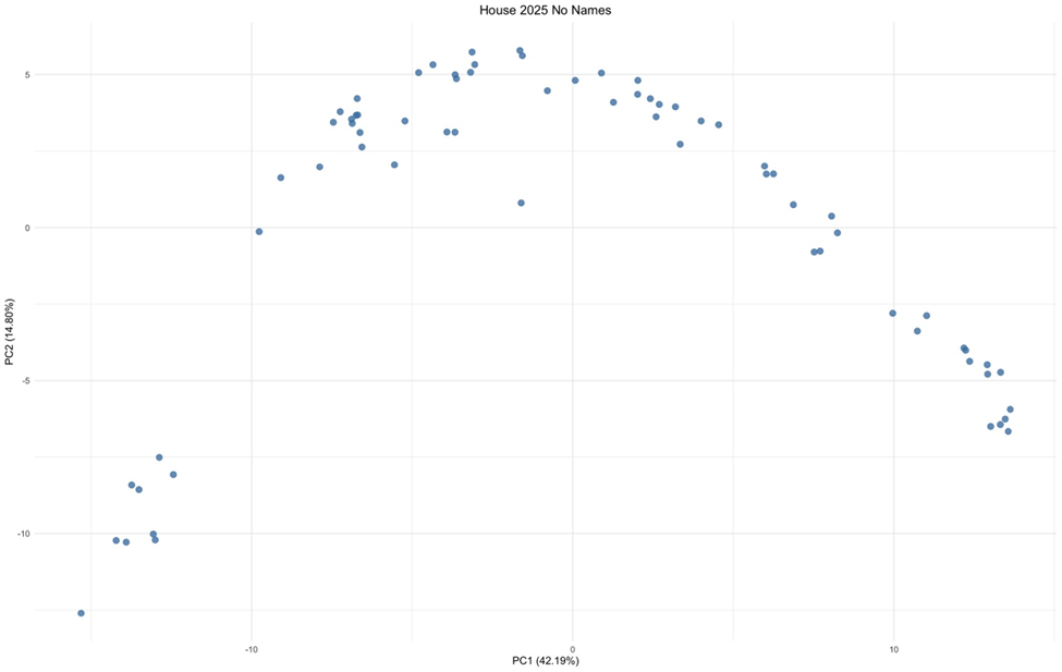
Each dot is a House legislator. No names yet, but it’s obvious that they indeed cluster into similarly voting groups, and the overall pattern is fairly simple.
This is a playing field of political ideology. It doesn’t help that the X and Y axes are ‘synthetic’ – created by the analysis to best explain the joint voting patterns – so they don’t have a neat definition. I don’t show how individual bills map – it’d make the chart too messy. But I can look at bill scores from IFF’s Indexes, and use them to show the overall trends:

The arrowheads show the direction of increasing score from IFF’s point of view – less spending, more freedom. (These are only labeling the chart; they didn’t affect the analysis.)
This defines the playing field a little better. Let’s look at some of the ‘gangs’. I’m going to call them clusters from here on – a more neutral term and the next standard technique I’ve applied: creating clumps of points based on their distance. Here’s what happens if I break the House into four clusters:
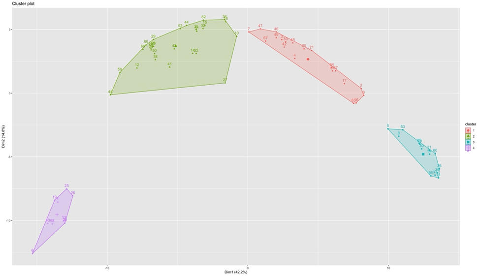
I’ve removed the arrows again for simplicity. The scale’s still too small to show names, so I’ll zoom in on the bottom left cluster:

As you might have suspected from the rating arrows, this is indeed the Democrat cluster, voting for state spending and power. Let’s leave them in left field, and turn to the other clusters. I’ll call the green cluster from above ‘Main Street’, the red one ‘Swing’ and the aqua one ‘Liberty’.
What? No Gang of Eight?
The five House members of the Gang are indeed at one tail of the Liberty cluster:
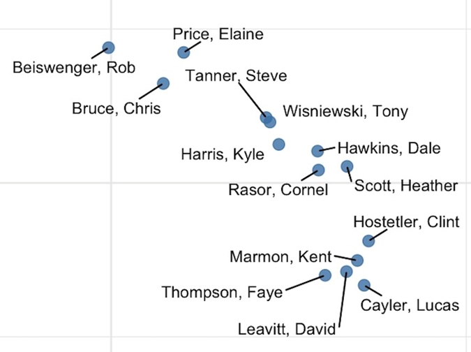
But let’s keep this in proportion:
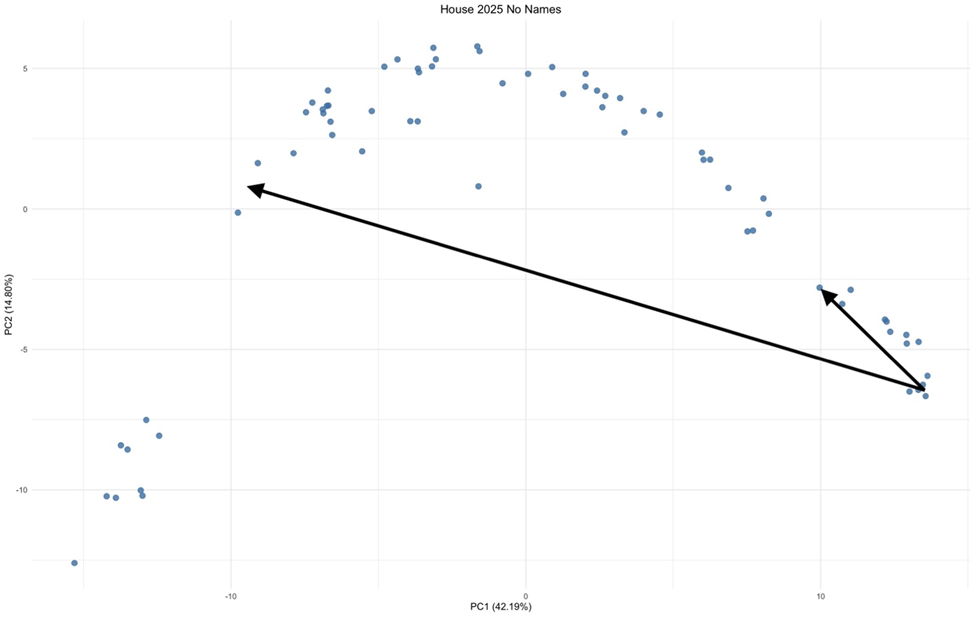
The small arrow is the distance between the Gang and the far end of the Liberty Cluster, Rob Beiswenger. The large one is the distance to the worst RINOs in the House, Jack Nelsen and Mark Sauter, who never saw a spending bill they didn’t like and are also backsliding on freedom issues. Perhaps the time and energy spent on click-bait internecine squabbling would be better spent on finding and promoting alternatives to the RINOs?
The Best of the Rest
Here’s a look at the Swing cluster:
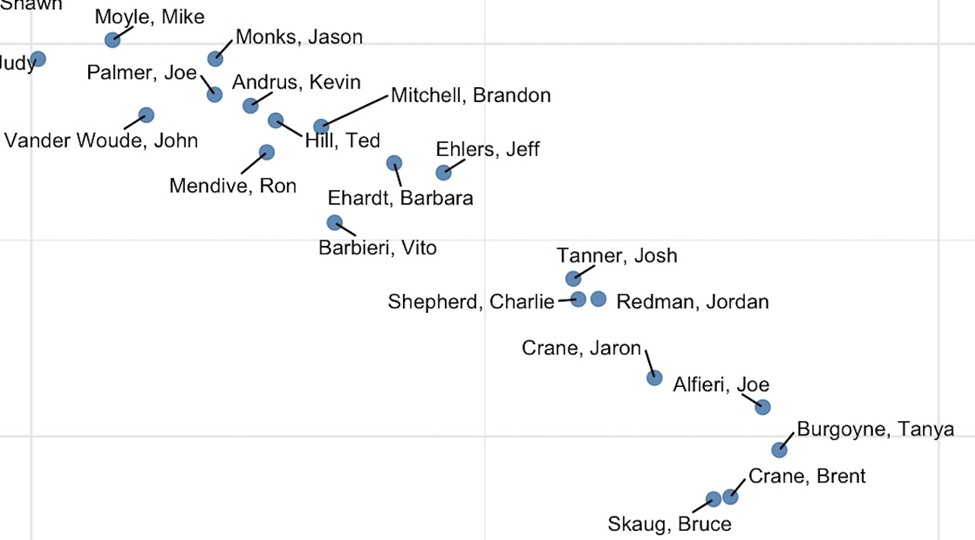
That’s Judy Boyle hanging off the left side. Even the oft-derided Mike Moyle makes it into the swing cluster. What separates these legislators from the Liberty and Main Street clusters is that they mix aye and nay votes on funding measures. The further to the right, the less spending they supported, and the reverse to the left. (See an afterword for further discussion.)
Where the RINOs Roam
Call it the Main Stream cluster, call it IACI-land, call it the GOPe:
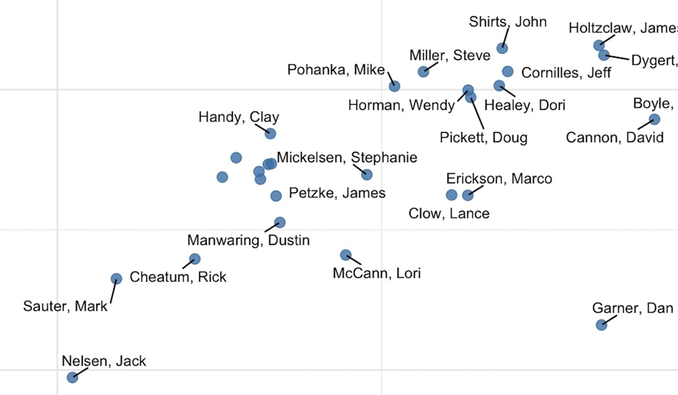
Some of them vote in such lock-step that the chart program can’t figure out how to squeeze their names in: Fuhriman, Furniss, Raybould, Wheeler and Raimond are the five dots at left of center.
The orientation of this cluster shows that when you vote to fund a bigger government, you’re also likely to start giving it more power over your constituents.
Conclusions
Once you’ve got the map, you don’t need the scorecards. In fact, scorecards – and even more, endorsements – start to tell you more about the organization making them than about the legislators.
The map helps you see what’s a difference that makes a difference, and what’s an attempt to gain attention or create a wedge issue. Idaho conservatives should keep this in mind for the 2026 session and primary.
Afterword 1 – The Senate
Using the same procedures as with the House results in the following, with names visible since there are fewer players:
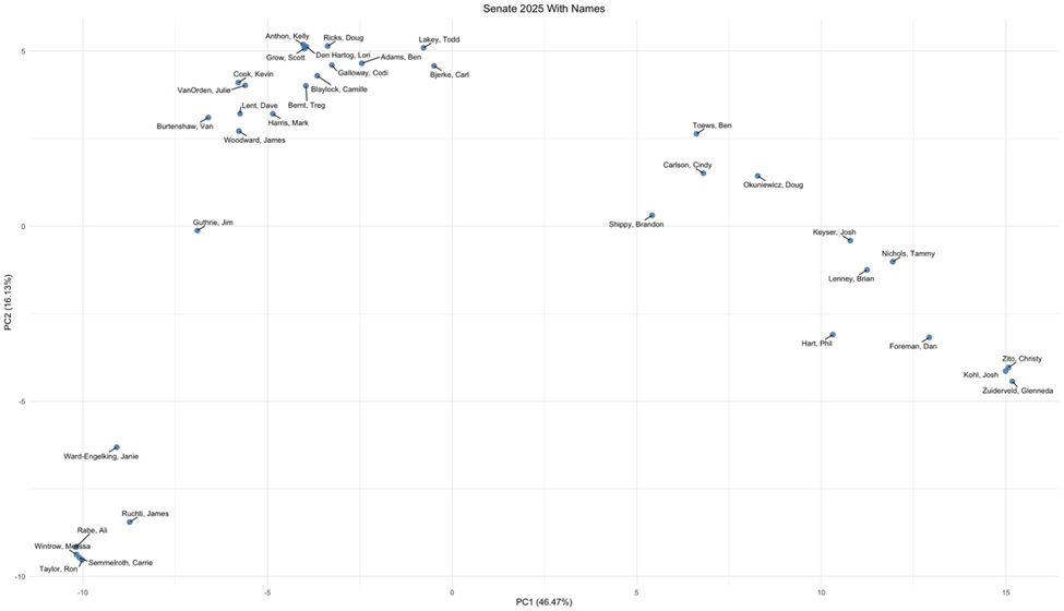
Although the list of bills that came to the floor for a full vote differs from the House, the distribution of legislators on the map is remarkably similar. This gives some confidence that this method is robust, as the underlying ideological territory should be extremely similar, even if it’s defined by a different list of bills and votes. The resulting clusters are also remarkably similar:
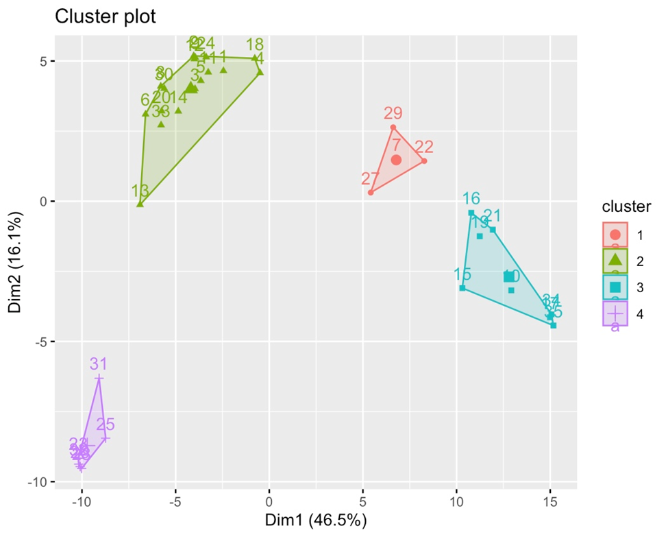
Again, the members of the Gang of 8 form one end of the Liberty cluster, but also again the distance within that cluster is dwarfed by that to the head RINO, Guthrie.
The Swing cluster is much smaller. Senate votes, particularly on spending issues, are more polarized.
Afterword 2 – Stats Stuff
Dimensional reduction of vote patterns was done with principal components analysis, followed by clustering with K-means, implemented with the prcomp and kmeans library functions on the ‘R’ freeware statistics platform. Visualizations were created with fviz_cluster or ggplot2 and ggrepel.
Afterword 3 –JFAC, the Swing cluster, and Session Mapping
I ran a similar study for the 2023 session, that was never published. That year’s overall map was very similar to 2025, but the Swing group for the House was much smaller, and there was no such group in the Senate.
What changed between 2023 and 2025? The legislature’s budgeting procedures: In 2023 and before, JFAC (the joint Senate/House budgeting committee) produced one budget bill per agency, take it or leave it. It was a rare legislator who split aye and nay votes on these bills. In 2024, JFAC instead began producing two bills per agency: a base continuation bill, and a second enhancements/additional proposal. This gave legislators an option to assume a middle position on spending by voting aye on the base, and nay on the increase, and many of them took it. It’s a safe bet that many of the budgeting fights in 2026 and onward will center on what the executive branch and/or the big spenders can argue into the base budgets.
JFAC also introduces a wrinkle in mapping as an ongoing process during the session. Anyone conversant in statistics can look at these results and see that you don’t need every floor vote to create a map – a much smaller sampling would suffice, and you might be able to do that as the session progresses. However, the budget votes don’t start until the bills pop out of JFAC, later in the session, and those votes are the largest variation among legislators.
About Tim Oren
Tim Oren retired to Idaho after a 30 year career in Silicon Valley. Here he gardens, home-brews, teaches kids to shoot, and has applied his well-aged statistics degree to subjects such as educational funding and results, Idaho legislative race targeting, and now legislators' voting patterns. He is a contributor to the Idaho Freedom Foundation and a number of Idaho candidates.


